
taste of balkan's pickles
*
taste of balkan's pickles *
Packaging Design
Hero Presentation
Developed for Euro Foods & Drinks Ltd, the Taste of Balkan’s pickle range was created as a flexible FMCG packaging system capable of bringing together a broad selection of traditional Balkan vegetables, pulses and preserved foods under one recognisable identity.
The design needed to communicate authenticity and familiarity while still feeling contemporary enough for modern retail environments. Rather than treating every product as an unrelated label, a consistent visual structure was established across the range, allowing customers to recognise the brand immediately while still distinguishing each variety at a glance.
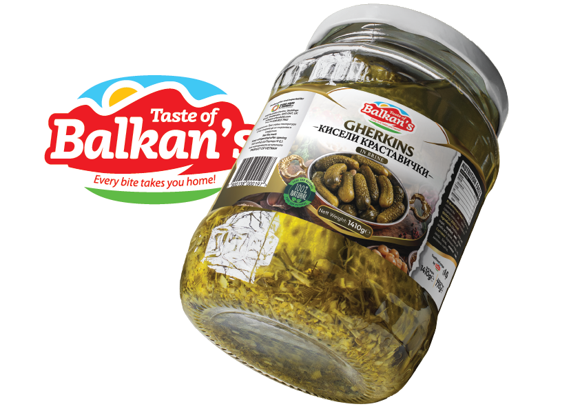
The Taste of Balkan’s logo is positioned prominently at the top centre of every label, creating a clear and repeatable focal point across the collection. Large bilingual product names, realistic serving imagery and carefully selected colour accents work together to communicate the contents quickly and clearly, even when the products are viewed from a distance on crowded supermarket shelves.
Product Range
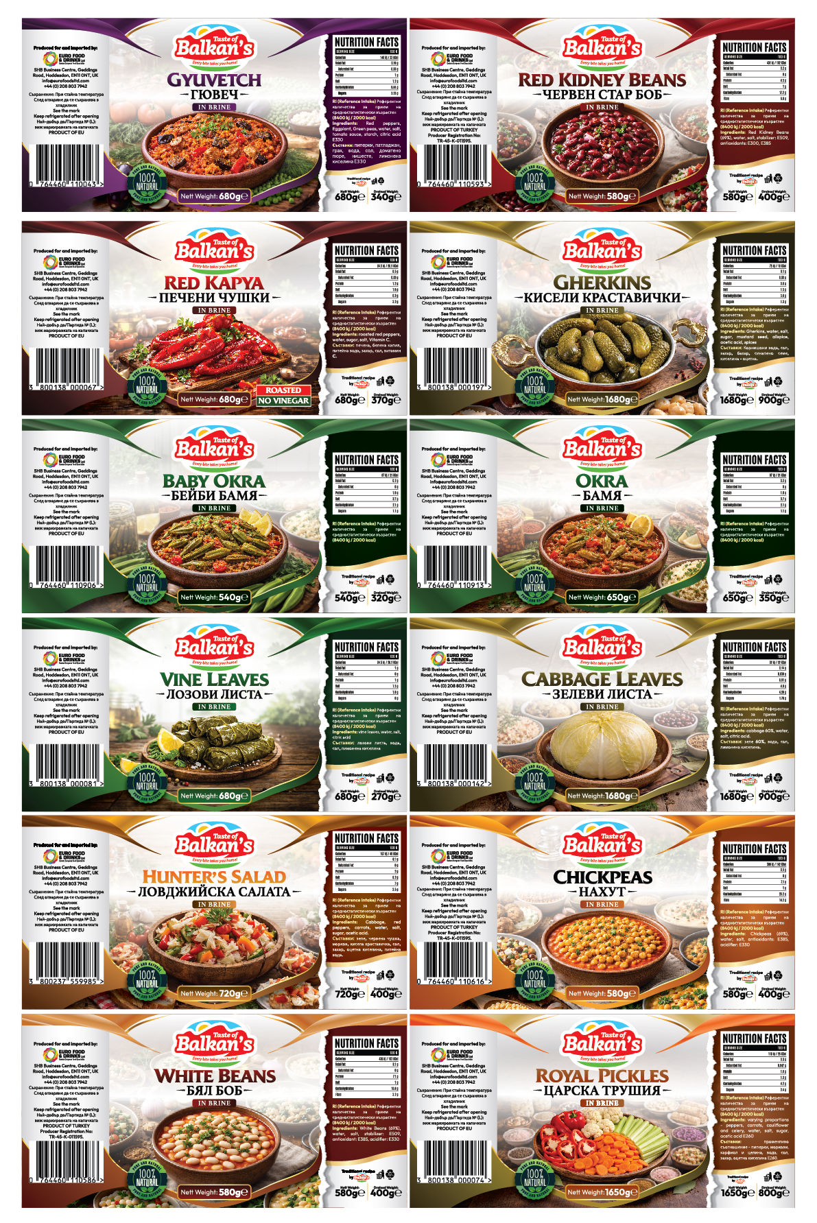
The complete project consists of 18 SKUs, including 12 individual product varieties and a further six size extensionsdeveloped from existing products. For the portfolio presentation, the 12 unique varieties were selected to demonstrate the breadth of the system without repeating the same design at different jar sizes.
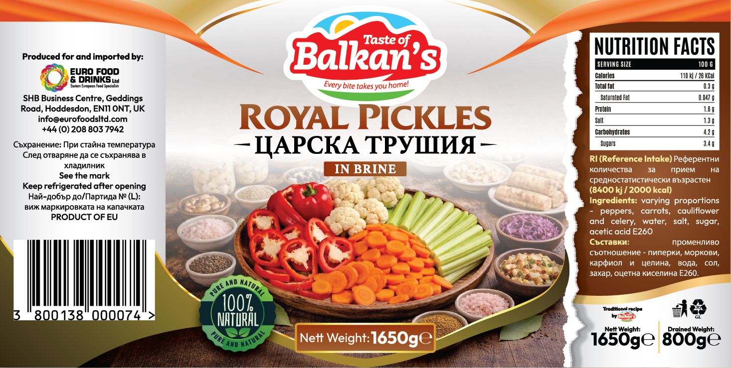
The range includes products such as Gherkins, Royal Pickles, Gyuvetch, Red Kidney Beans, Red Kapya Peppers, Baby Okra, Okra, Vine Leaves, Cabbage Leaves, Hunter’s Salad, Chickpeas and White Beans. Although the products differ considerably in colour, texture and serving style, they are unified through a shared label architecture, consistent typography, curved framing elements and centrally positioned food imagery.
This system allows the collection to expand without weakening the brand. New products can be introduced by adapting the colour palette, photography and product-specific information while retaining the same recognisable visual language.
Colour System
Colour was used as both a visual storytelling tool and a practical navigation system across the range. Each product was assigned a palette inspired by its ingredients, flavour profile or familiar culinary associations, helping consumers differentiate between varieties while preserving consistency across the wider family.
Rich greens were selected for vegetable-led products such as Baby Okra, Okra and Vine Leaves, reinforcing freshness, natural ingredients and their connection to traditional garden produce. Deeper green tones were used where the product needed to feel more robust and savoury, while lighter green accents created a fresher and more delicate character.
Warm reds and burgundy tones were introduced for Red Kidney Beans, Red Kapya Peppers and other products associated with stronger flavours, roasted ingredients or tomato-based dishes. These colours create appetite appeal and communicate richness, warmth and traditional home cooking.
Earthy brown, gold and cream tones were used for products such as Chickpeas, White Beans, Cabbage Leaves and Gherkins. These palettes reflect the natural colours of the ingredients while giving the products a more rustic, wholesome and authentic appearance.
Purple was chosen for Gyuvetch to give the product a distinctive identity within the collection. As a mixed vegetable dish containing several colours and ingredients, a richer purple palette helps it stand apart from the single-ingredient products while maintaining the premium character of the range.
The different colours are balanced by consistent white central areas and black side panels, ensuring the collection remains unified rather than appearing as a group of unrelated designs.
Food Presentation
Each label features a carefully composed serving image designed to show the product in a more appealing and familiar context. Rather than relying solely on photographs of vegetables inside jars, the products are presented as finished dishes or serving suggestions, helping customers imagine how they might be used at home.
The food imagery is placed centrally and framed by complementary ingredients, tableware and subtle background details. This creates depth and appetite appeal while keeping the product itself as the main focus.
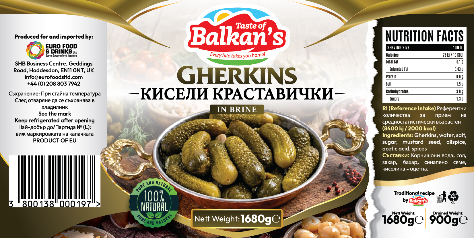
For example, Gherkins are shown in a traditional serving bowl alongside herbs and savoury accompaniments, while beans and chickpeas are presented as warm prepared dishes. Vine Leaves and Cabbage Leaves are displayed in recognisable serving arrangements, reinforcing their connection to traditional Balkan and Eastern European cuisine.
This approach gives the range a more premium retail presence while preserving the approachable, everyday character expected from preserved food products.
Production Artwork
Label Structure
The production artwork was developed around a consistent wrap-around label structure, ensuring that every product could accommodate branding, product imagery and technical information without compromising readability.
The central panel carries the strongest visual elements: the Taste of Balkan’s logo, bilingual product name, serving image, product description and net weight. The side sections were reserved for technical content including ingredients, nutritional information, importer details, storage instructions, barcodes and mandatory legal information.
Curved framing elements were repeated across the full range, helping guide the eye towards the centre of each label while also creating a recognisable visual signature. These curves were adjusted in colour to suit each product variety, allowing differentiation without altering the core layout.