
bulgarian pastry
*
bulgarian pastry *
Packaging Design
Hero Presentation
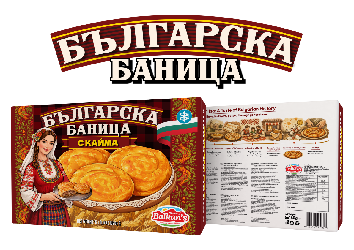
Developed for Euro Foods & Drinks Ltd, this packaging project was created for Българска баница (Balgarska Banitsa / Bulgarian Banitsa), one of Bulgaria’s most recognisable traditional dishes. The objective was to build a premium frozen-food range that communicates authenticity, craftsmanship and cultural heritage while remaining visually strong in a modern retail environment.
The design combines bold Cyrillic typography with rich cultural illustrations, traditional Bulgarian decorative patterns and an illustrated Bulgarian woman wearing folk costume. These elements create an immediate connection with the product’s origin while giving the range a distinctive and memorable shelf presence.
The project was developed as a complete three-product family consisting of Българска баница с кайма (Balgarska Banitsa s Kayma / Bulgarian Banitsa with Minced Meat), Българска баница със сирене (Balgarska Banitsa sas Sirene / Bulgarian Banitsa with Cheese) and Българска баница със спанак (Balgarska Banitsa sas Spanak / Bulgarian Banitsa with Spinach).
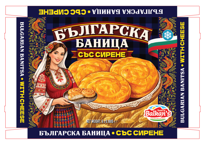
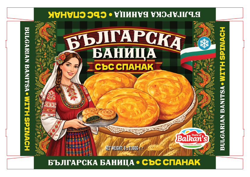
Each flavour uses a dedicated colour system—deep burgundy for minced meat, royal blue for cheese and forest green for spinach—allowing customers to distinguish the variants quickly while preserving a cohesive visual identity across the full range. Large, appetising product imagery balances the traditional artwork with contemporary retail appeal, creating packaging that feels both authentic and commercially effective.
Product Range
The Banitsa range was designed as a cohesive packaging system rather than a collection of individual products. Every variant shares the same typography, layout, decorative elements and cultural illustrations, ensuring strong brand recognition while allowing each flavour to establish its own personality.
Colour became the primary differentiator throughout the range. Rich burgundy reflects the hearty character of the minced meat filling, vibrant green communicates freshness for the spinach variety, and deep blue highlights the classic cheese recipe. This simple colour-coding system improves shelf navigation while preserving visual consistency across the product family.
Maintaining identical design proportions and artwork structure also simplified future product development, allowing additional flavours to be introduced without compromising the integrity of the brand.
Production Artwork
Front Panel
The front panel was engineered to maximise shelf visibility while remaining fully compliant with commercial printing requirements. A clear visual hierarchy places the product name and flavour at the centre of attention, supported by large product photography and authentic Bulgarian-inspired decorative artwork.
Every element was positioned according to the manufacturer's cutter guide, with bleed, safe areas and print tolerances carefully considered throughout the production process. Typography, product imagery, certification marks and mandatory information were all prepared to ensure accurate reproduction during commercial printing.
The result is artwork that combines strong visual impact with production-ready precision.
Reverse Panel
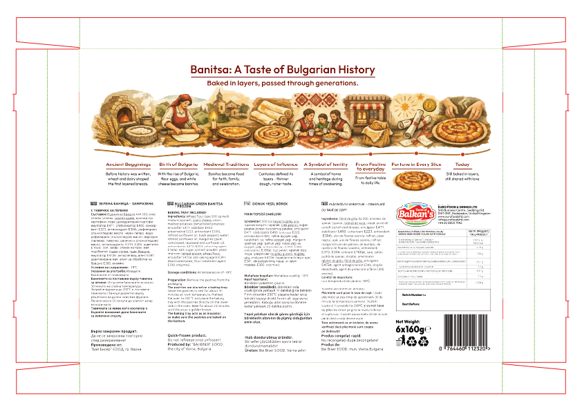
The reverse panel was designed to deliver information without sacrificing personality. Rather than presenting only technical content, the packaging introduces "Banitsa: A Taste of Bulgarian History," telling the story behind one of Bulgaria's best-known traditional dishes through a custom illustrated timeline.
This storytelling approach sits alongside multilingual ingredients, nutritional values, cooking instructions, storage guidance, legal information and barcode placement, creating an engaging customer experience while remaining fully compliant with retail packaging requirements.
The artwork was carefully organised using a clear information hierarchy, ensuring excellent readability while meeting all commercial production standards.
Complete Packaging System
The complete packaging system was developed from initial concept through to final production artwork, covering every visible surface of the carton across all three flavour variants. Each package was prepared according to the manufacturer's technical specifications, including cutter guides, bleed allowances, safety margins, barcode positioning, multilingual content and print-ready artwork.
By combining consistent branding, culturally inspired storytelling and accurate production preparation, the project delivers a packaging system that performs both commercially and technically. It demonstrates not only creative packaging design but also a thorough understanding of FMCG production workflows and manufacturing requirements.