diyos ayran
*
diyos ayran *
Packaging Design
Hero Presentation
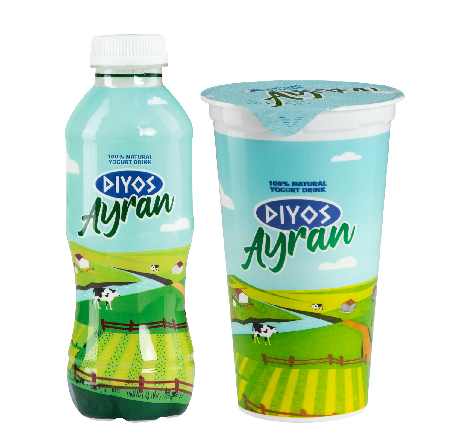
Developed for Extra Cash & Carry / Best Catering, Diyos Ayran represents the everyday extension of the premium Diyos Collection. While the Collection range targets premium products, Diyos was created to offer high-quality everyday dairy products with a more approachable and accessible identity.
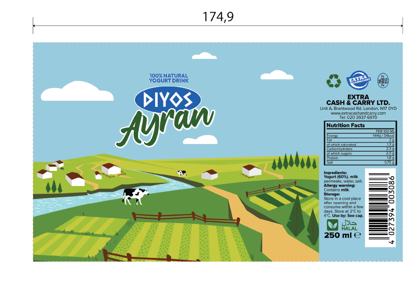
The objective was to create packaging that immediately communicates freshness, authenticity and natural ingredients while remaining distinctive within a highly competitive dairy category. Instead of relying on conventional product photography, the design introduces an illustrated countryside featuring rolling fields, grazing cows and a bright blue sky, creating a timeless visual language that can easily expand across future dairy products within the brand.
A palette of soft blues and vibrant greens reinforces freshness, purity and the natural origin of yoghurt, while the handwritten Ayran typography introduces warmth and personality. Together with the geometric Diyos logo, the design balances contemporary branding with traditional dairy heritage, creating a packaging system that feels both modern and approachable.
Packaging System
The project was developed as a complete packaging system covering both 250 ml yoghurt drink bottles and 250 ml yoghurt cups, ensuring a consistent brand experience across multiple product formats.
Although each container required different proportions and print layouts, the core visual identity remained unchanged. The countryside illustration wraps naturally around each package, allowing the river, fields and grazing cows to continue across the visible surfaces while maintaining immediate brand recognition from every viewing angle.
This consistent visual language allows future dairy products to be introduced without redesigning the entire identity, creating a scalable packaging system rather than individual package designs.
Production Artwork
Bottle Label
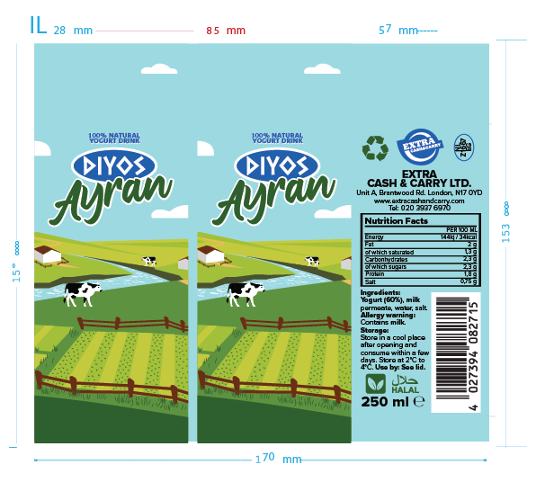
The bottle label artwork was developed for a 250 ml yoghurt drink bottle, with final print dimensions of 170 × 153 mm. The illustrated landscape was carefully adapted to wrap seamlessly around the bottle's cylindrical surface, preserving the continuity of the countryside scene while ensuring the primary branding remains visible from multiple viewing angles.
The production artwork incorporates nutritional information, ingredients, barcode, recycling symbols, legal copy and manufacturer details, all positioned according to the print specifications and safe areas required for commercial production. The final artwork was fully prepared with bleed, trim and print tolerances suitable for high-volume manufacturing.
Yoghurt Cup
The yoghurt cup artwork was developed at 174.9 × 103.5 mm, following the manufacturer's cutter guide precisely. The wider format allowed the landscape illustration to expand across the visible panels, creating a panoramic countryside scene that reinforces the product's natural origin while maintaining clear brand recognition.
Technical information, including nutritional values, ingredients, storage instructions, barcode and mandatory legal content, was carefully organised within the printable area to achieve a clean visual hierarchy without compromising readability. The final artwork was prepared for commercial printing and automated cup application.
Cup Lid
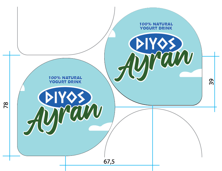
The peel-off lid artwork was produced specifically for the manufacturer's die-line, measuring 67.5 × 78 mm. Unlike the body artwork, the lid adopts a simplified composition that prioritises immediate brand recognition when displayed in refrigerated cabinets.
The clear sky-blue background, subtle cloud illustrations and prominent Diyos Ayran branding maintain consistency with the wider packaging system while avoiding unnecessary visual clutter on the limited print area. All artwork was prepared according to production specifications, ensuring accurate die-cutting, printing and sealing throughout the manufacturing process.
Complete Packaging System
The complete production artwork was developed across the bottle, yoghurt cup and peel-off lid, creating a unified packaging system capable of supporting multiple dairy formats while maintaining consistent branding.
Each artwork was individually adapted to its respective print dimensions and manufacturing requirements, ensuring accurate placement of branding, technical information and mandatory legal content without compromising the continuity of the visual identity. By combining scalable illustration, consistent typography and production-ready artwork, the project delivers a cohesive packaging solution that balances strong shelf presence with efficient commercial manufacturing.