
peppier tortilla
*
peppier tortilla *
Packaging Design
Hero Presentation
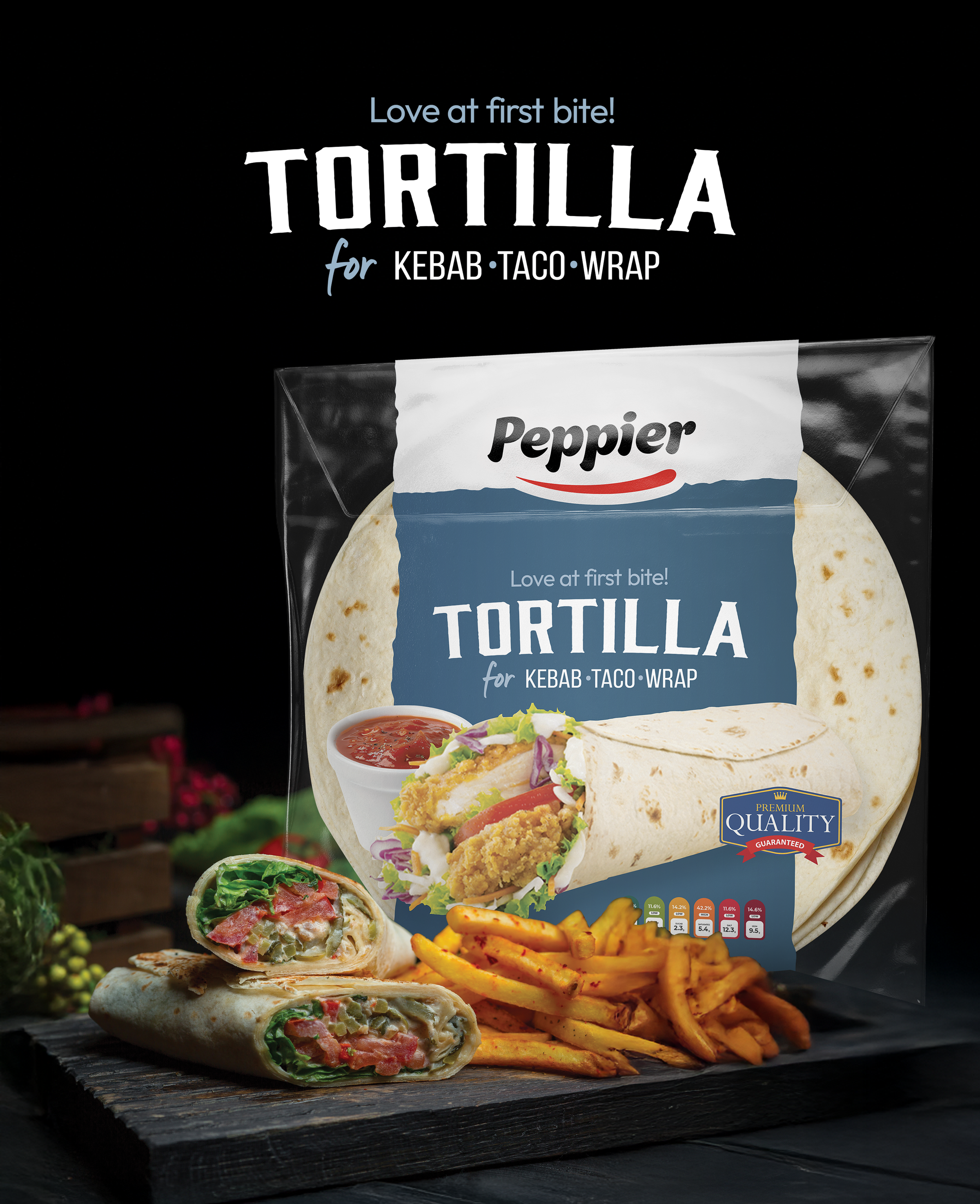
Developed for 6868 Food Services, the Peppier Tortilla packaging was designed to reposition a traditional tortilla wrap as a premium foodservice product suitable for kebabs, tacos and wraps. The objective was to create packaging that feels modern, appetising and versatile while standing out in chilled retail environments.
Rather than overwhelming the design with multiple visual elements, a clean central composition was created using a torn-paper graphic, bold typography and a large serving image. The transparent packaging allows the tortillas themselves to become part of the presentation, reducing the need for excessive product photography while reinforcing freshness and product quality.
A muted blue colour palette was selected to communicate cleanliness, trust and premium quality, contrasting with the warm colours of the prepared wrap and creating a balanced visual hierarchy. Together with the Peppier branding, the result is a contemporary packaging design that feels simple, confident and highly recognisable.
Packaging Concept
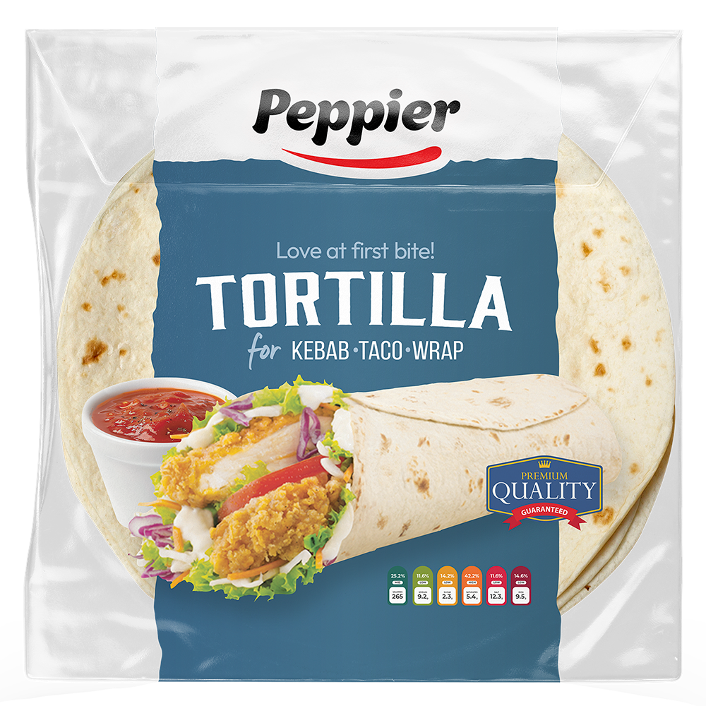
The packaging was designed around a transparent flow-wrap format, allowing the tortillas to remain fully visible while using a printed central band to carry the brand identity. This approach reduces unnecessary visual clutter and allows the product itself to become the hero of the packaging.
The large wrap serving suggestion immediately communicates versatility, demonstrating that the tortillas are suitable for multiple food applications rather than a single cuisine. Supporting typography, quality seals and nutritional indicators reinforce the product's premium positioning while maintaining a clean and approachable appearance.
The overall structure was intentionally kept simple, allowing the design system to be easily adapted across future tortilla sizes or flavour variations while preserving a consistent visual identity.
Production Artwork
Sleeve Artwork
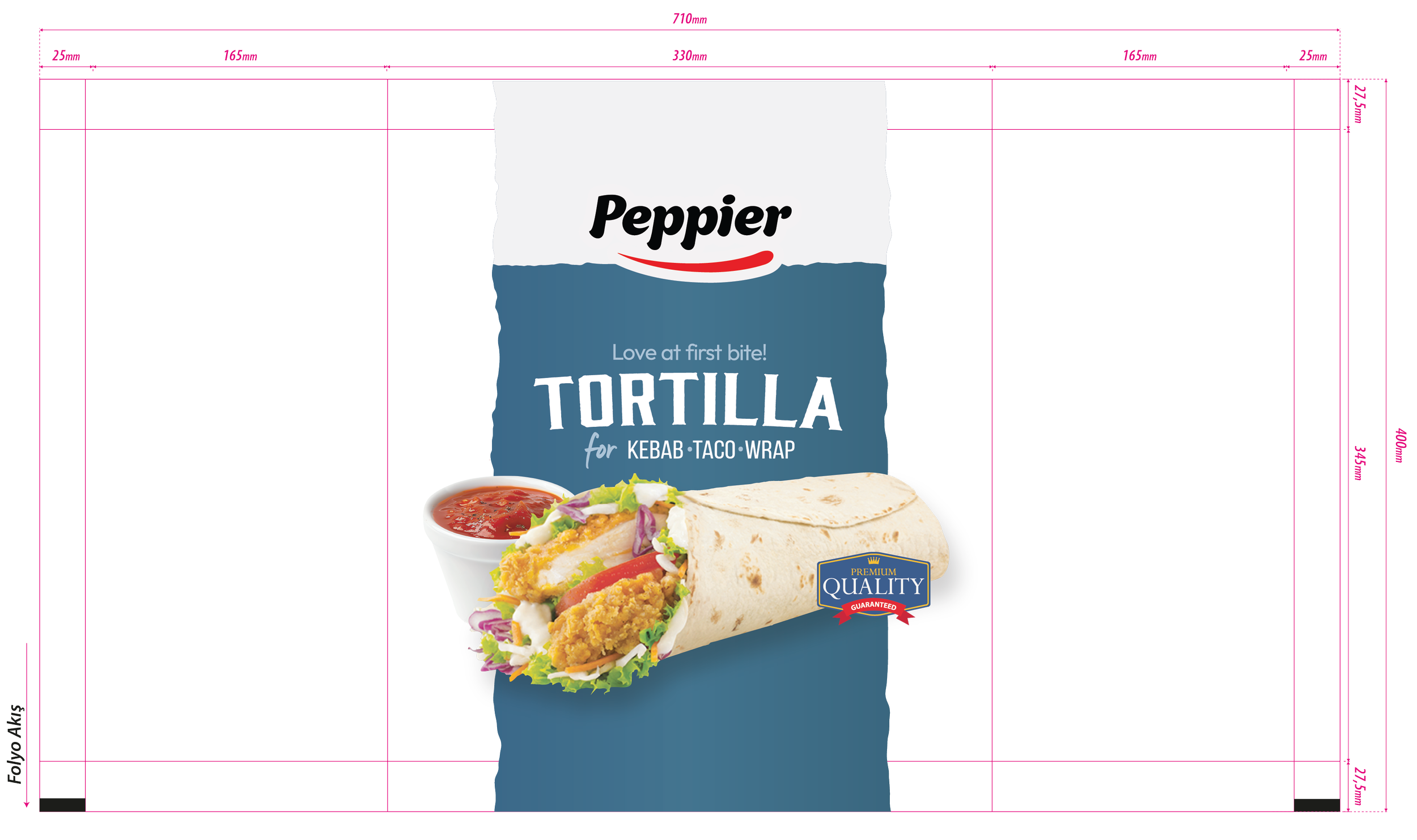
The production artwork was developed for a 710 × 400 mm printed flow-wrap sleeve, following the manufacturer's cutter guide and fold specifications. The central printed panel measures 330 mm, while the remaining areas were reserved for sealing, folding and transparent product display.
The artwork was carefully positioned to ensure the branding and hero product image remained perfectly centred after folding, while accounting for production tolerances and the visibility of the tortillas through the clear film. Every graphic element was prepared with bleed, trim and safe areas suitable for commercial manufacturing.
Packaging Layout
The production layout was engineered specifically for high-speed automated packaging lines. The printed centre panel was designed to align precisely with the front-facing product, while the transparent side sections maximise product visibility without compromising structural integrity.
Typography, product imagery and branding were carefully positioned to remain fully visible after folding and sealing, ensuring a clean presentation from every viewing angle. The layout also provides sufficient space for mandatory product information, batch coding and additional production requirements where required.
Complete Packaging System
The final production artwork combines premium visual presentation with manufacturing efficiency, creating a packaging solution that is both commercially practical and visually distinctive.
Every element—from the torn-paper graphic and bold typography to the transparent film areas and wrap illustration—was prepared according to the manufacturer's technical specifications. The finished artwork is fully production-ready and demonstrates how a simple packaging structure can achieve strong shelf presence through thoughtful composition, typography and material choice rather than excessive graphic complexity.