peppier baked beans
*
peppier baked beans *
Packaging Design
Hero Presentation
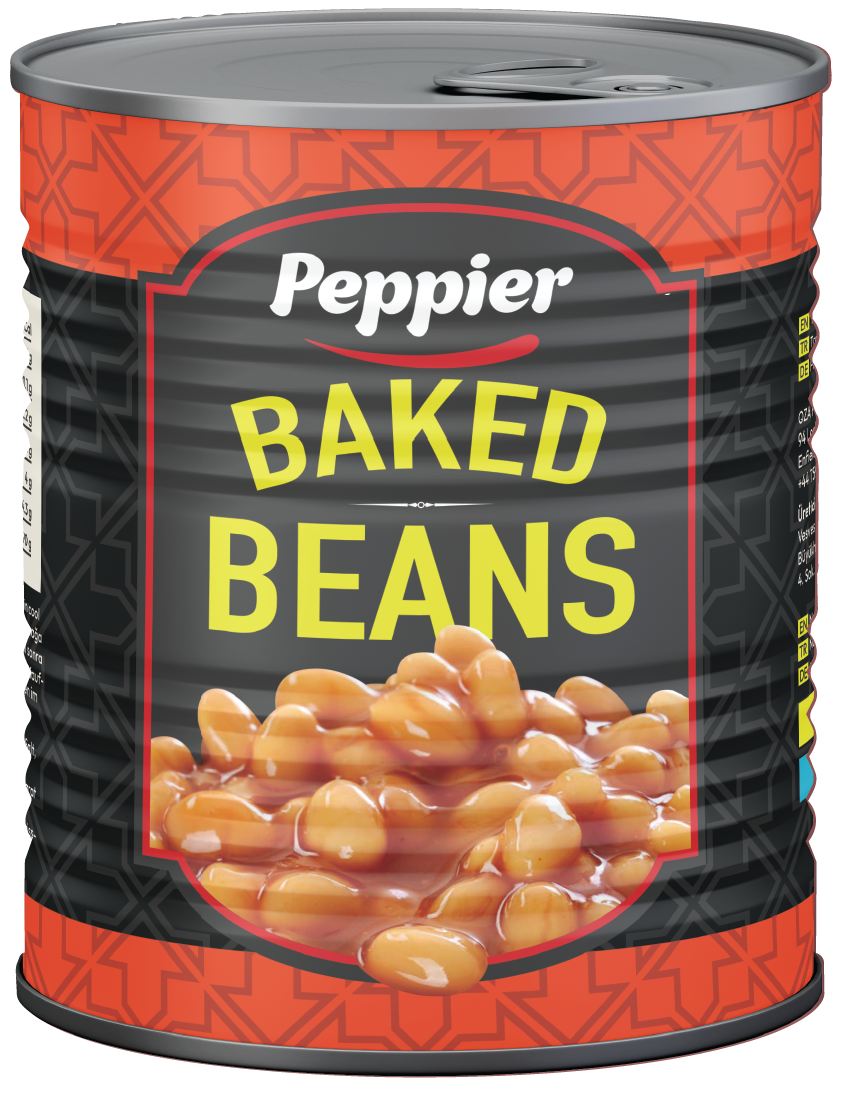
Developed for 6868 Food Services, the Peppier Baked Beans packaging was designed to create a bold, modern identity within a highly competitive canned food category. The objective was to maximise shelf visibility through a strong visual hierarchy while communicating quality, convenience and appetite appeal.
A predominantly black background was selected to give the product a more premium appearance, allowing the vibrant baked beans and bright yellow typography to become the primary visual focus. Contrasting red framing elements and geometric decorative patterns introduce energy and personality without overwhelming the central product presentation.
The result is a clean, contemporary packaging design that balances strong retail presence with clear product communication while remaining flexible enough to support future product extensions within the Peppier range.
Product Development
During the development process, two separate concepts were explored to support potential product variations. The red version was developed as the primary packaging for the traditional baked beans recipe, using warm colours that reflect the richness of the tomato sauce and create strong appetite appeal. Alongside this, a green concept was designed for a preservative-free and no-added-sugar variant. The fresh green palette was chosen to communicate healthier ingredients, freshness and a lighter nutritional profile while maintaining the same brand architecture and visual identity. Although the client ultimately decided to proceed with the original baked beans recipe, the alternative concept demonstrates how the packaging system could easily expand into healthier product lines without requiring a complete redesign.
Production Artwork
Can Label
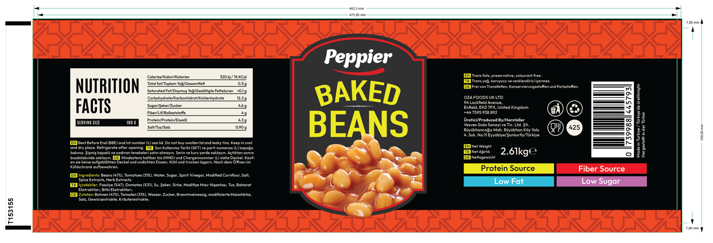
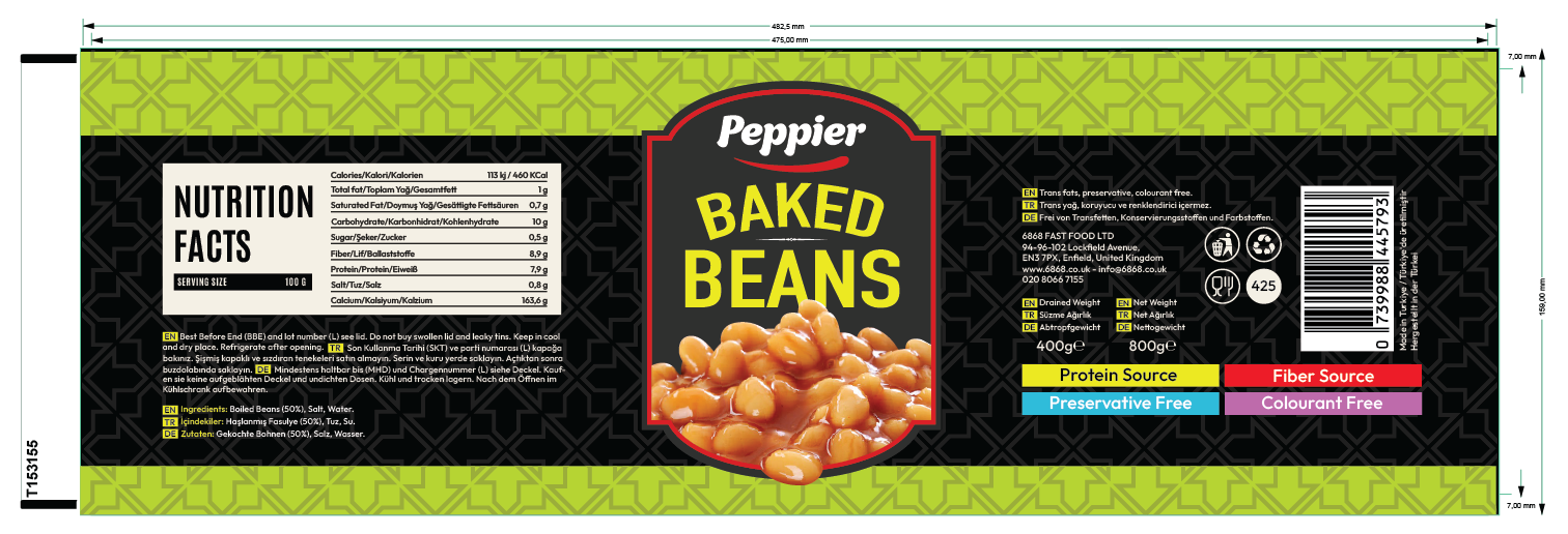
The production artwork was developed for a 425 g cylindrical can, with a final label size of 425.5 × 133.45 mm. The artwork wraps seamlessly around the container, ensuring the central branding remains perfectly aligned while maintaining continuity across the side panels. The front presentation features the Peppier logo, bold product typography and large food photography, while the remaining label area accommodates multilingual ingredients, nutritional information, manufacturer details, barcode, recycling symbols and mandatory legal content. Every element was organised according to the manufacturer's specifications to ensure production-ready accuracy and efficient commercial printing.
Complete Packaging System
The complete packaging artwork was prepared for commercial manufacturing, incorporating every technical requirement necessary for large-scale production.
The final production files include multilingual product information, nutritional values, ingredients, barcode placement, recycling symbols, net weight, product claims and mandatory legal content, all carefully arranged within the manufacturer's cutter guide and printable area. Particular attention was given to typography, spacing and visual hierarchy, ensuring technical information remained highly legible without compromising the overall shelf impact of the design.
The result is a production-ready packaging system that combines strong branding, flexible product development and commercial manufacturing accuracy, providing 6868 Food Services with a scalable identity capable of supporting future additions to the Peppier product range.