fishspaper
*
fishspaper *
Packaging Design
Hero Presentation
Developed for My Food Service in Horsham, Fishspaper was created to transform traditional fish and chips packaging into an interactive storytelling experience. Inspired by the nostalgic tradition of serving fish and chips wrapped in newspaper, the concept reimagines classic British newsprint through a contemporary packaging system filled with fictional headlines, articles, puzzles and illustrations.
Rather than treating the packaging as disposable, every surface was designed to encourage customers to continue engaging with the brand while enjoying their meal. Humorous newspaper stories, hidden details and playful editorial layouts transform an ordinary takeaway box into part of the dining experience, reinforcing the identity of the business long after the food has been served.
The monochrome colour palette, newspaper typography and hand-illustrated graphics preserve the familiarity of traditional newsprint while presenting it in a clean, modern format suitable for commercial food packaging.
Storytelling System
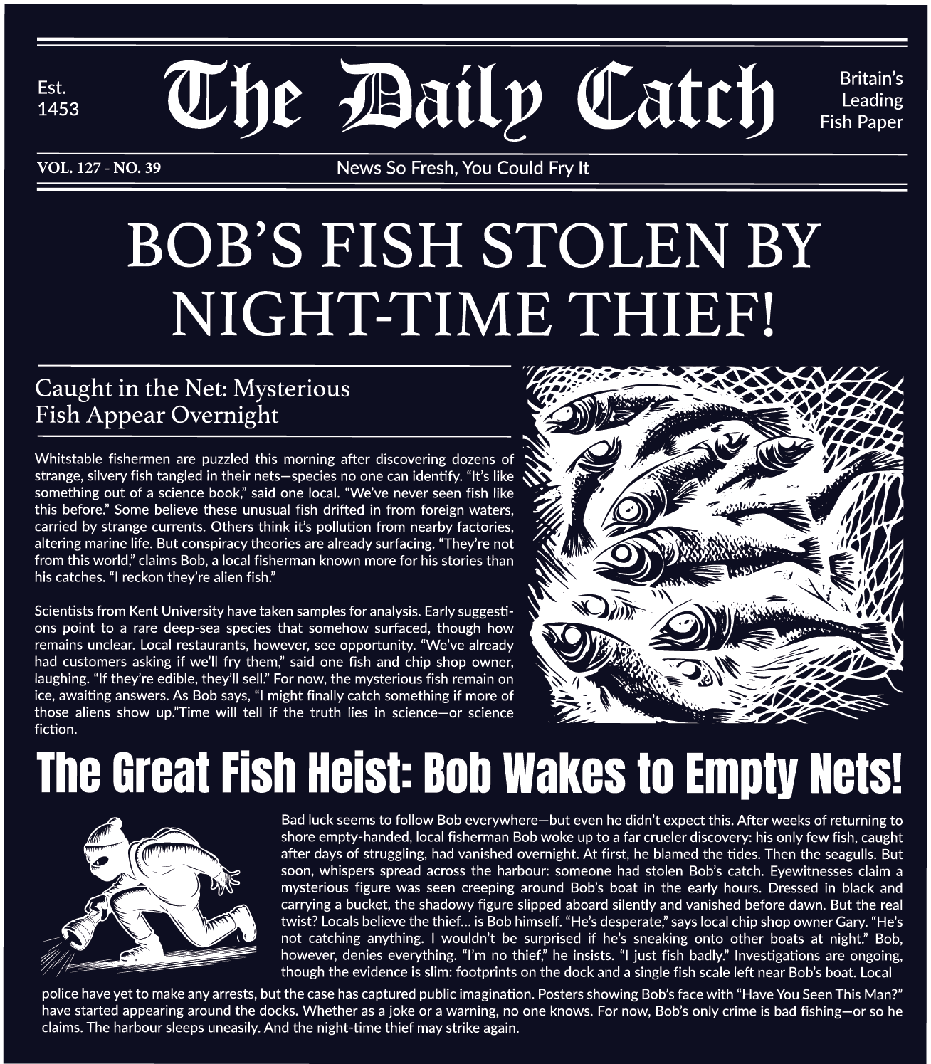
The packaging was built around an original fictional newspaper titled The Daily Catch, allowing every box to become a collection of interconnected stories rather than a repeating graphic pattern.
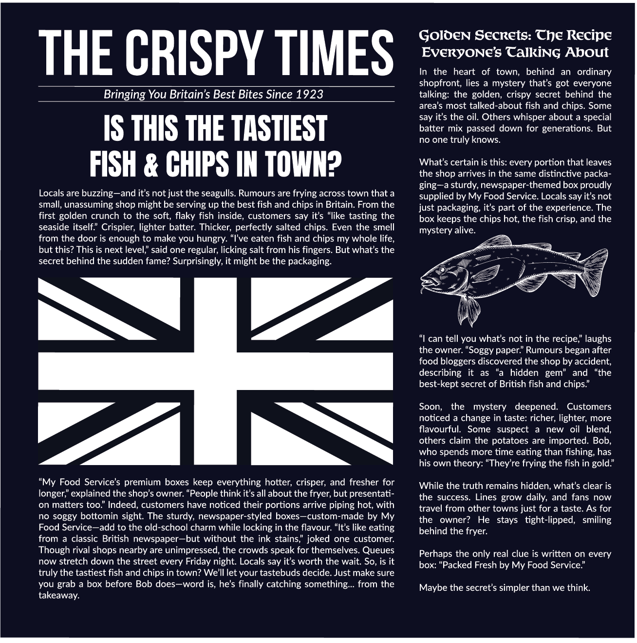
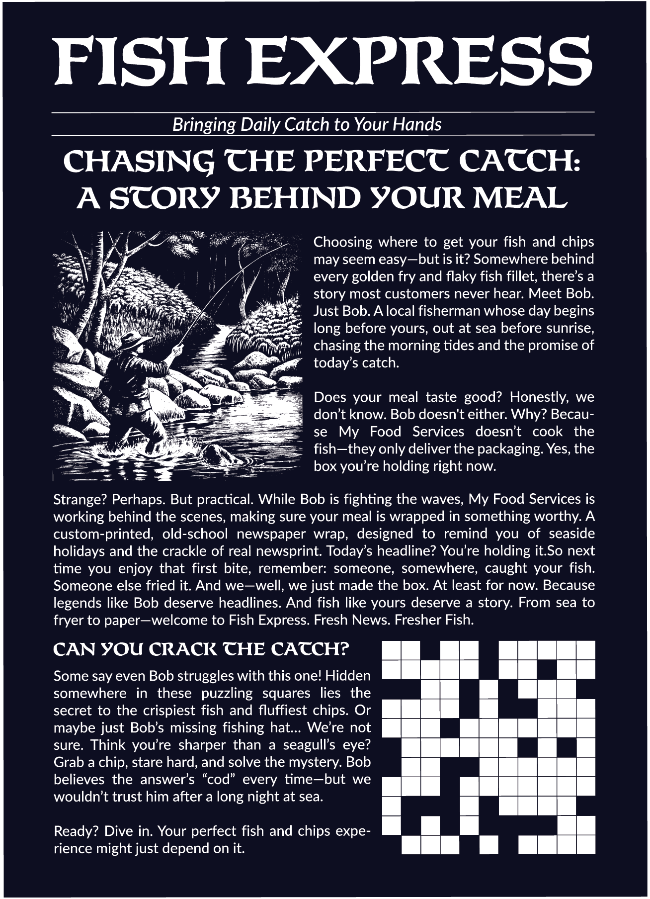
Customers encounter humorous front-page headlines such as "Bob's Fish Stolen by Night-Time Thief!", fictional investigations, local newspaper articles, crossword puzzles and feature stories that all revolve around the same imaginary seaside community. One article explores the mystery behind Britain's tastiest fish and chips, while another follows the adventures of Bob, a fisherman whose stories continue throughout different areas of the packaging.
Instead of functioning purely as decoration, every article was intentionally written to reward curiosity. Customers who spend time reading the packaging gradually discover recurring characters, hidden jokes and references that create a memorable brand experience extending far beyond the meal itself.
Packaging Collection
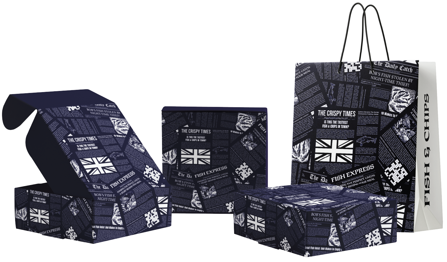
The concept was developed as a complete takeaway packaging family consisting of fish & chips boxes, burger boxes, takeaway cartons and branded carrier bags. Despite the variety of packaging formats, every item shares the same newspaper-inspired visual language, allowing the products to work together as a unified retail system.
Repeating editorial layouts, illustrated graphics and consistent typography create immediate recognition across the collection while allowing each package to reveal different stories and newspaper sections. This prevents the designs from feeling repetitive and encourages customers to explore every side of the packaging.
The result is a flexible branding system capable of expanding into future takeaway products while maintaining a distinctive and highly memorable identity.
Production Artwork
Editorial Artwork
Unlike conventional food packaging, the artwork was produced as a series of fully designed newspaper pages before being integrated into the packaging layouts. Headlines, columns, illustrations, puzzles and fictional news articles were individually typeset to recreate the structure and reading experience of a traditional British newspaper.
Each editorial page was carefully composed to balance readability with visual rhythm, ensuring the layouts remained engaging without becoming overcrowded. Decorative fish illustrations, crossword puzzles, vintage typography and recurring storylines work together to reinforce the newspaper concept while maintaining production-ready accuracy.
Packaging Layout
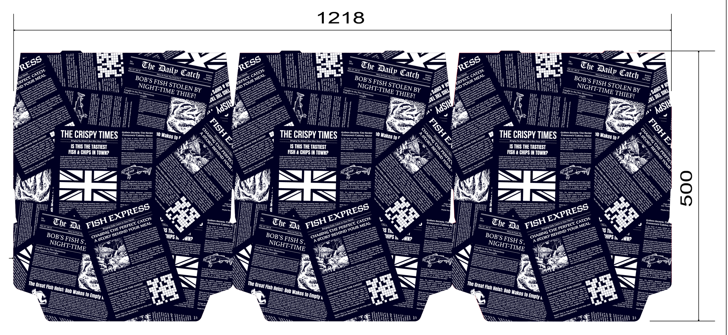
The complete packaging artwork was adapted to a 1218 × 500 mm production layout, allowing multiple packaging panels to be arranged efficiently for commercial printing and die-cutting.
Every newspaper article, illustration and headline was positioned to flow naturally across the finished packaging, taking fold lines, panel transitions and viewing angles into account. Particular attention was given to ensuring that major headlines remained uninterrupted after assembly while allowing smaller editorial content to continue seamlessly across neighbouring panels.
This careful planning preserves the illusion of a genuine newspaper even after the flat artwork is folded into three-dimensional packaging.
Complete Packaging System
The final production artwork combines branding, storytelling and structural packaging design into a single production-ready system developed specifically for My Food Service.
Every package within the collection was prepared according to the relevant cutter guides and manufacturing specifications, incorporating accurate bleed, fold lines and print tolerances while preserving the integrity of the editorial layouts. The completed system demonstrates how packaging can move beyond product protection to become an integral part of the customer experience.
By combining narrative-driven design, traditional newspaper aesthetics and technically precise production artwork, Fishspaper transforms ordinary takeaway packaging into a memorable brand experience that customers are encouraged to read, explore and remember.