love at first bite
*
love at first bite *
packaging design x production artwork
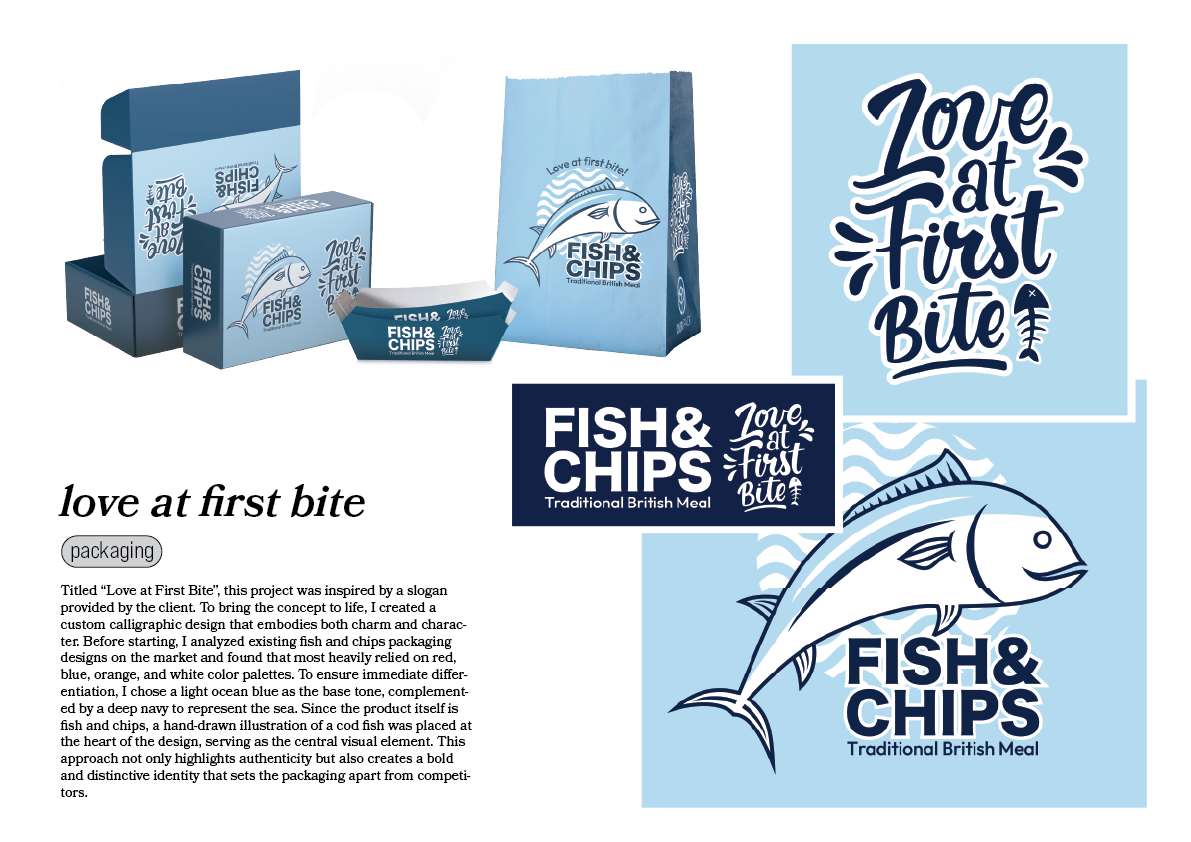
Developed for 6868 Food Services, Love at First Bite was created around the slogan provided by the client, transforming it into a distinctive visual identity for a fish & chips packaging range. To reinforce the concept, a custom calligraphic logotype was designed to convey warmth, personality and a handcrafted character.
Before starting the design process, research was carried out on existing fish & chips packaging, revealing that most competitors relied heavily on red, orange, blue and white colour palettes. To create immediate shelf differentiation, a light ocean blue was selected as the primary colour, complemented by a deep navy inspired by the sea. A hand-drawn cod illustration became the central visual element, reinforcing the product's identity while giving the packaging a distinctive and memorable appearance.
Alongside the creative concept, the complete production artwork was prepared for commercial printing. Every element—including branding, illustrations, nutritional information, legal content and print specifications—was carefully organised according to the manufacturer's cutter guides, ensuring the packaging was both visually engaging and fully production-ready.