vera
*
vera *
Logo Design
Brand Identity
The objective of this project was to create the visual identity for Vera, a premium skincare brand named after both the client and her company. The brief called for a logo that would communicate purity, softness and trust while remaining modern enough to support an expanding range of skincare products.
Unlike many cosmetic brands that rely on decorative typography or complex symbols, the identity was intentionally developed around a minimalist typographic approach. Clean geometric letterforms and generous spacing create a calm, refined appearance that reflects the gentle nature of skincare products while allowing the brand to feel approachable and premium at the same time.
The identity was designed to appeal equally to male and female customers, avoiding visual stereotypes often associated with cosmetic branding. Instead, the logo communicates inclusivity through subtle colour choices rather than overt styling, allowing the products to remain accessible to a wider audience.
Brand Colours
Colour & Icon Strategy
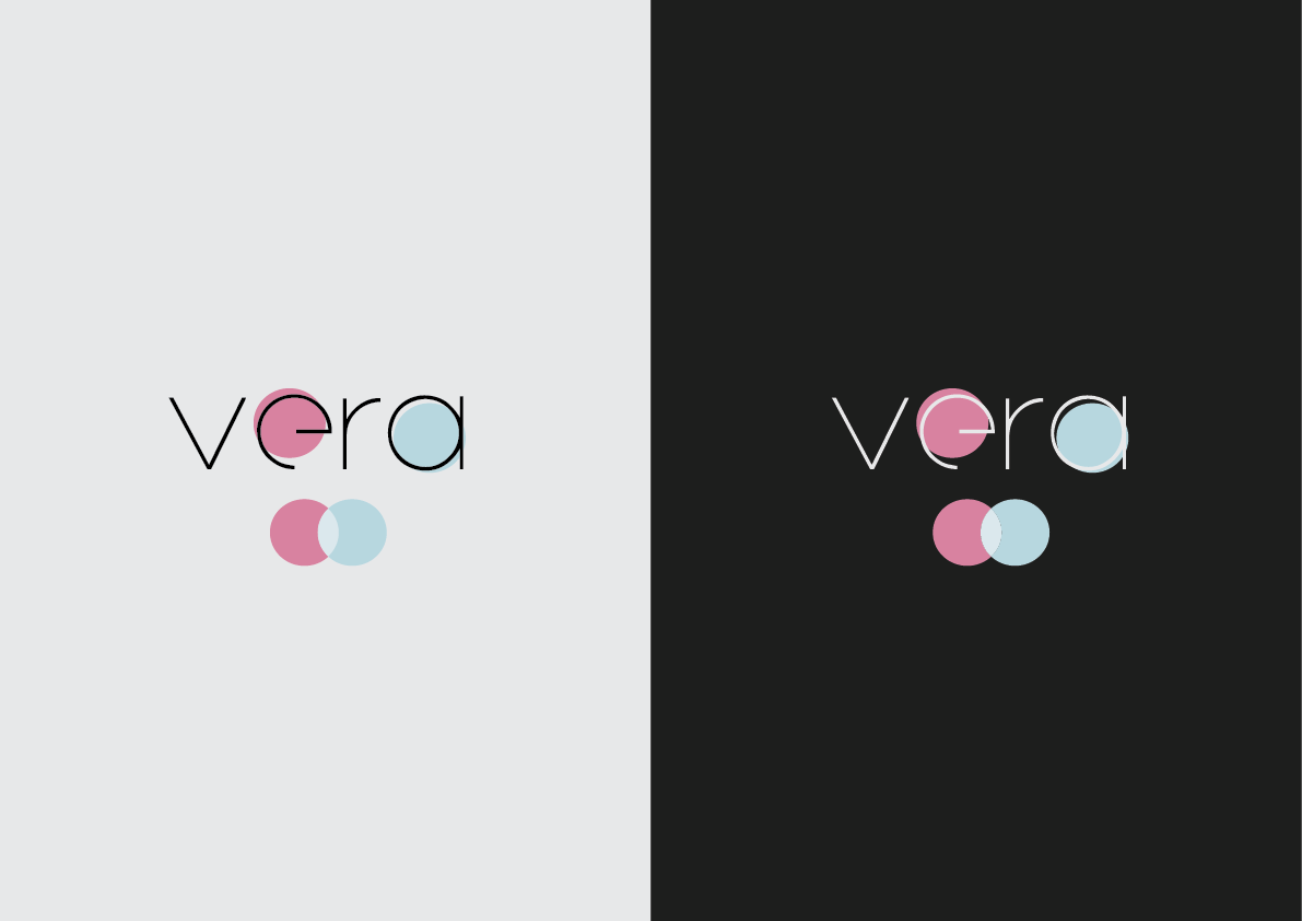
The defining feature of the identity is the pair of overlapping circles integrated into the logo.
The baby blue circle represents the brand's male skincare products, while the soft pink circle symbolises the female range. Their overlap represents the shared philosophy behind the brand—high-quality skincare designed for everyone while recognising the different product lines offered to each audience.
The circles also serve as an independent brand symbol. While they initially support the Vera wordmark, the icon was deliberately designed to become recognisable on its own over time, allowing the company to build strong brand recognition without always relying on typography. This flexibility makes the identity suitable for packaging, social media, product applications and future brand extensions.
Visual Consistency
A restrained colour palette was selected to reinforce the clean and sensitive character of the brand.
Soft baby pink and baby blue were chosen to communicate care, cleanliness and calmness while distinguishing the two primary customer groups. These pastel tones introduce colour without overwhelming the minimalist aesthetic, allowing the logo to remain elegant across both digital and printed applications.
To maximise versatility, two official logo variations were created: one optimised for light backgrounds and another specifically designed for dark surfaces. This ensures the identity maintains excellent contrast and readability regardless of where it is applied while preserving complete visual consistency across every brand touchpoint.
Identity System
Logo Applications
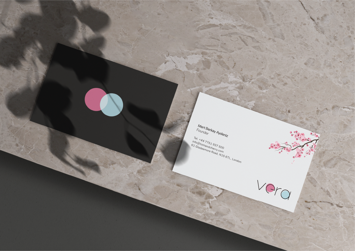
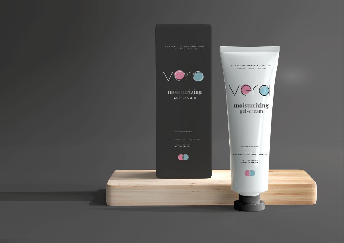
The supporting visuals demonstrate how the Vera identity performs across different branding applications while keeping the logo as the primary visual element.
The business cards, skincare packaging and promotional mock-ups were designed to showcase the flexibility of the identity in realistic commercial environments. Particular attention was given to maintaining generous white space, refined typography and understated layouts, ensuring that the minimalist philosophy established by the logo carries consistently throughout the entire visual identity.
Rather than competing with the brand mark, every supporting application was intentionally designed to emphasise the logo, allowing the identity to remain the strongest and most memorable element across all customer touchpoints.