diyos collection
*
diyos collection *
Logo Design
Brand Identity
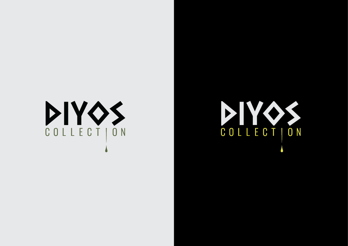
The objective of this project was to create the visual identity for Diyos Collection, a premium Mediterranean food brand specialising in olive oil products. While the client had already selected the name "Diyos", they wanted the brand to communicate elegance, authenticity and Mediterranean heritage, with the identity intended primarily for a range of Greek-inspired products.
To reinforce this positioning, the logo was developed using typography inspired by Ancient Greek letterforms. Rather than creating a literal historical interpretation, the lettering combines geometric shapes with modern proportions, producing a distinctive mark that feels both premium and contemporary while subtly referencing classical Greek culture.
As the client intended to expand beyond a single product into multiple premium ranges, the word "Collection" was introduced beneath the main logo. This transforms the identity from a single product logo into a flexible master brand capable of supporting future collections while strengthening the perception of exclusivity and craftsmanship.
One of the defining elements of the identity is the small oil droplet extending from the letter "I" in Collection. This subtle detail immediately reinforces the product category without overwhelming the logo, creating an elegant visual cue that connects the identity directly to olive oil and Mediterranean ingredients.
Brand Colours
Colour Strategy
The colour palette was deliberately kept minimal to maximise recognition and versatility across packaging and marketing materials.
Olive-inspired green was selected for applications on light backgrounds, directly referencing olive trees, Mediterranean landscapes and natural ingredients. For dark applications, a rich olive yellow replaces the green, representing the warm golden tones of freshly pressed olive oil while maintaining strong visibility against black surfaces.
Using two carefully considered variations allows the logo to retain maximum contrast across different applications without compromising brand consistency. Together, the green and yellow create an immediate association with olives, oil and premium Mediterranean produce.
Identity System
Logo Applications
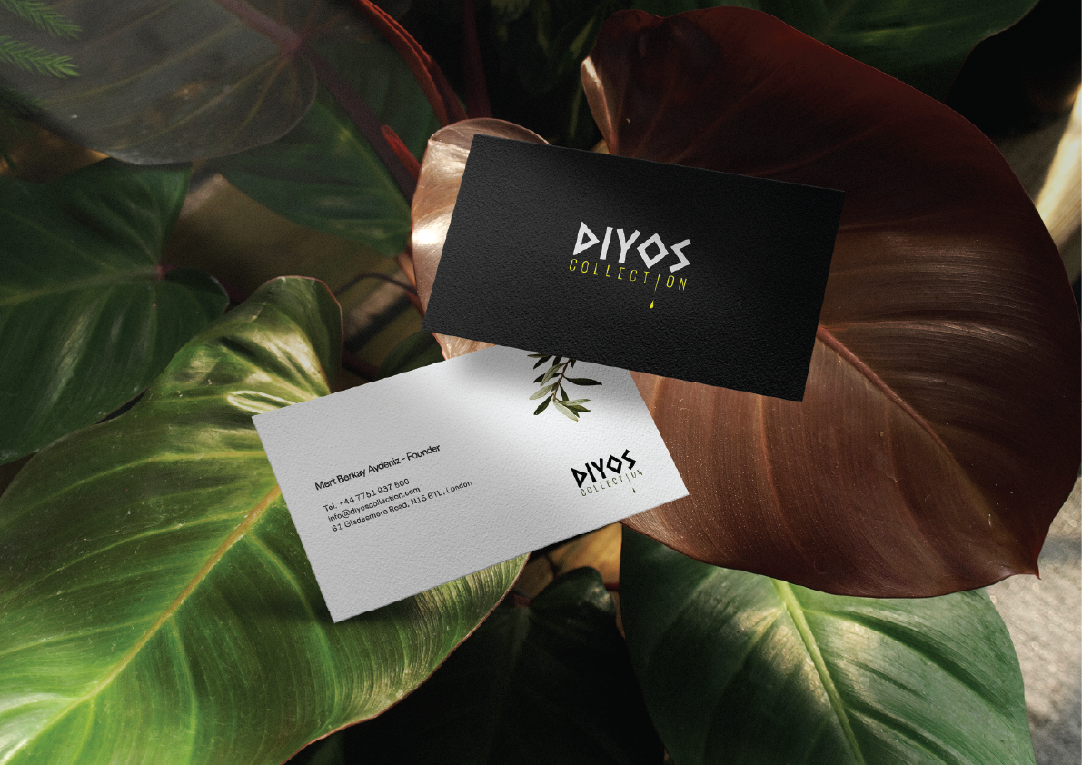
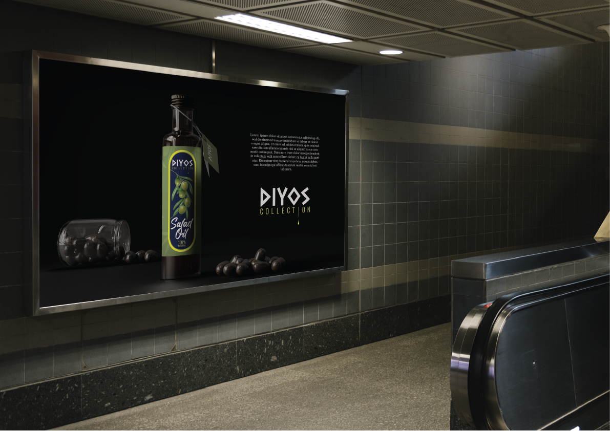
To ensure the identity remained flexible across different media, two official logo versions were developed: one optimised for light backgrounds and another specifically designed for dark surfaces. This guarantees consistent readability regardless of where the brand appears, from packaging and printed material to advertising and digital media.
The supporting visuals shown here demonstrate how the identity performs beyond the logo itself. The salad oil bottle, business cards, billboard advertisement and branded presentation materials were all designed to showcase the logo in realistic commercial applications. These mock-ups illustrate how the identity scales across different formats while maintaining a premium and cohesive appearance.
Rather than relying on decorative graphics, the surrounding designs intentionally remain restrained, allowing the logo to become the primary visual asset and establishing a strong, recognisable brand presence across every touchpoint.