tom and cherry
*
tom and cherry *
Logo Design
Brand Identity
The objective of this project was to create a memorable and approachable visual identity for Tom and Cherry, a greengrocer specialising in fresh fruit and vegetables. The client wanted a brand that felt friendly, energetic and instantly recognisable, standing apart from the clean, minimalist identities commonly found in food retail.
The name itself became the foundation of the concept. Tom and Cherry intentionally echoes the famous cartoon duo Tom and Jerry, creating an immediate sense of familiarity and humour. This subtle resemblance makes the brand easier to remember while giving it a playful personality that naturally encourages customer engagement.
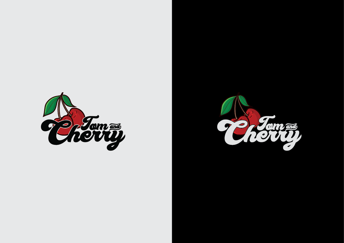
To reinforce this cheerful identity, I developed a bold, hand-lettered typographic logo with rounded curves and flowing connections between the characters. The playful lettering reflects the fresh, welcoming atmosphere expected from a neighbourhood greengrocer while ensuring the brand remains distinctive and full of character.
Brand Symbol
Recognition Through Simplicity
Rather than relying solely on typography, the logo is supported by a simple but highly recognisable cherry illustration positioned behind the wordmark.
The cherry immediately communicates the nature of the business, allowing customers to identify the shop even before reading the name. From a distance, the bright red fruit acts as a visual landmark, making the storefront easier to recognise while reinforcing the playful identity established by the brand name.
The symbol is also capable of functioning independently from the typography. As the business grows, the cherry icon can become a recognisable brand asset for packaging, signage, social media and promotional materials without requiring the full wordmark to accompany it.
Colour Strategy
Freshness & Personality
The colour palette was deliberately kept natural and vibrant to reflect the products sold by the business.
Rich cherry red immediately attracts attention and creates a strong focal point, while the fresh green leaves reinforce ideas of freshness, healthy produce and nature. The contrast between these colours creates a lively visual identity that feels energetic without becoming overwhelming.
To maximise flexibility, two logo variations were created: one optimised for light backgrounds and another for dark applications. This ensures consistent readability and visual impact across packaging, printed materials, signage and digital media while maintaining the same recognisable brand identity.
Identity System
Logo Application
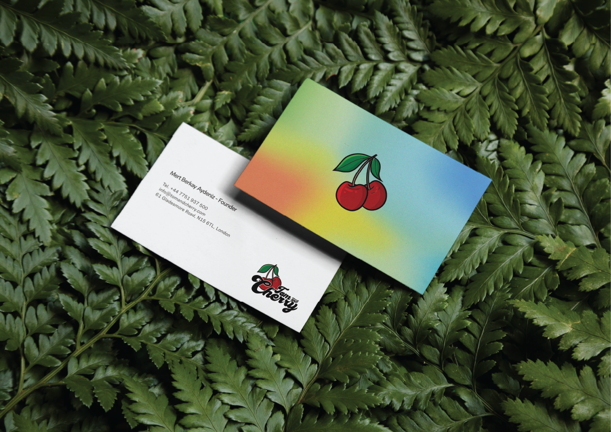
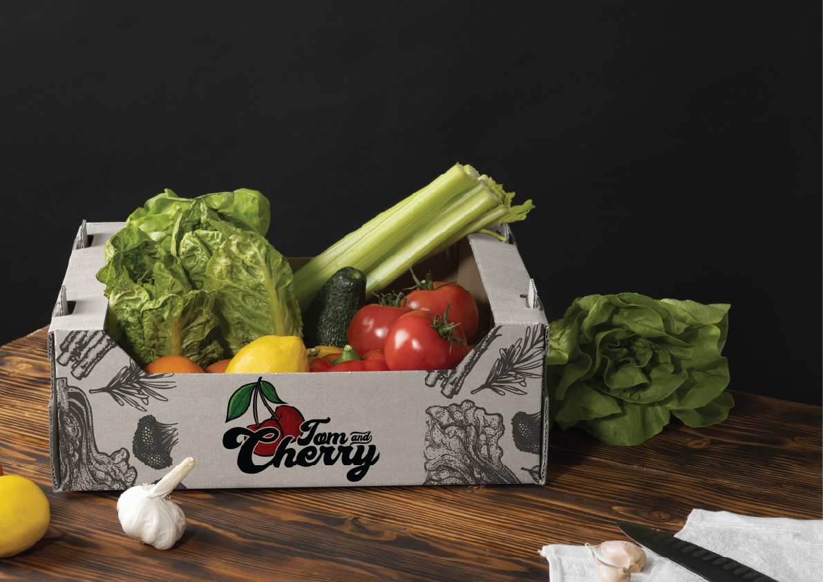
The supporting visuals demonstrate how the Tom and Cherry identity performs across a variety of branding applications while keeping the logo as the central visual element.
The business cards, produce crate and presentation mock-ups were created to showcase how the identity translates into practical, real-world use. The playful logo remains the hero across every application, while the cherry symbol provides an instantly recognisable visual cue that strengthens brand recall.
By combining humorous naming, expressive typography and a simple fruit icon, the identity creates a memorable brand that feels welcoming, distinctive and perfectly suited to a modern neighbourhood greengrocer.