ministry of videography
*
ministry of videography *
Logo Design
Brand Identity
The objective of this project was to create a distinctive identity for Ministry of Videography, a creative studio specialising in videography, photography, video editing, motion graphics and audio production. Rather than following the typical trend of using a camera lens or play button as the entire logo, the aim was to build a visual identity that reflected the complete creative process behind professional video production.
The concept takes inspiration from European heraldry and coat of arms, giving the brand a prestigious and timeless appearance. The word "Ministry" suggests professionalism, authority and expertise, so a heraldic shield became the perfect foundation for communicating those values while helping the brand stand out from traditional videography businesses.
Coat of Arms
Every Service Has Its Place
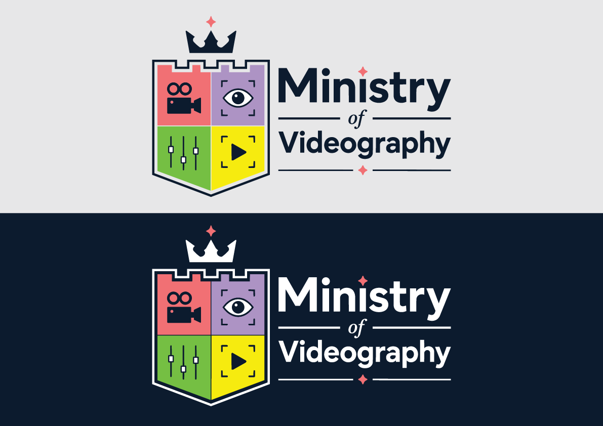
The shield is divided into four sections, each representing one of the company's core services.
The video camera symbolises professional videography, event filming and commercial productions.
The eye inside a focus frame represents photography, composition and the ability to capture moments with precision.
The audio mixer sliders represent sound recording, mixing and post-production, acknowledging that professional video is as much about audio as it is about visuals.
The play button inside a focus frame represents video editing, colour grading, motion graphics and the final stage where all creative elements come together.
Together, these four symbols communicate that Ministry of Videography offers a complete production service rather than specialising in only one part of the filmmaking process.
Colour Strategy
Creative Without Chaos
Each quadrant of the shield features a different colour to distinguish the studio's individual creative disciplines while maintaining a cohesive identity.
The warm coral, purple, green and yellow sections provide energy and personality, reflecting the diverse nature of creative production without overwhelming the overall design. These vibrant colours are balanced by dark navy outlines and typography, ensuring the logo remains clean, professional and highly legible.
To maximise flexibility, I also created two versions of the identity. The first is designed for light backgrounds, using dark outlines and typography for maximum contrast. The second is optimised for dark backgrounds, where the typography and shield outline switch to white while preserving the original colours inside the coat of arms. This allows the identity to remain consistent across websites, social media, clothing, print materials and video graphics.
Identity System
Built for Every Platform
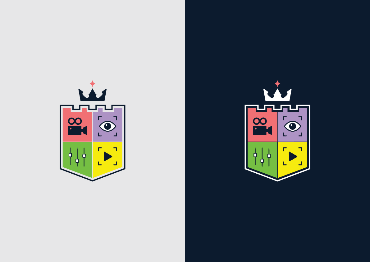
The supporting graphics demonstrate how the logo performs across different applications while keeping the heraldic emblem as the central visual element.
The shield is capable of functioning independently from the full wordmark, allowing it to become an instantly recognisable brand mark for profile pictures, video watermarks, camera equipment, merchandise and social media content.
By combining traditional heraldic design with modern creative symbols, the identity creates a unique brand that communicates professionalism, versatility and expertise across every stage of video production—from filming concerts and events to photography, editing, motion graphics and sound design.