bessa
*
bessa *

Logo Design
Brand Identity
The objective of this project was to create a modern and professional identity for Bessa Ltd, a wholesale supplier specialising in medical nitrile examination gloves and essential consumables for the foodservice and retail industries. Alongside its own Bessa Gloves range, the company supplies products such as napkins, food containers, bin bags and other everyday catering essentials. The goal was to create a logo that reflected both the company's product range and its reliable distribution network.
Instead of using a literal glove or medical symbol, the identity focuses on the company's role as a supplier. The result is a clean, memorable logo that communicates logistics, reliability and business efficiency while remaining flexible enough to represent an expanding product portfolio.
Brand Symbol
Packaging Meets Distribution
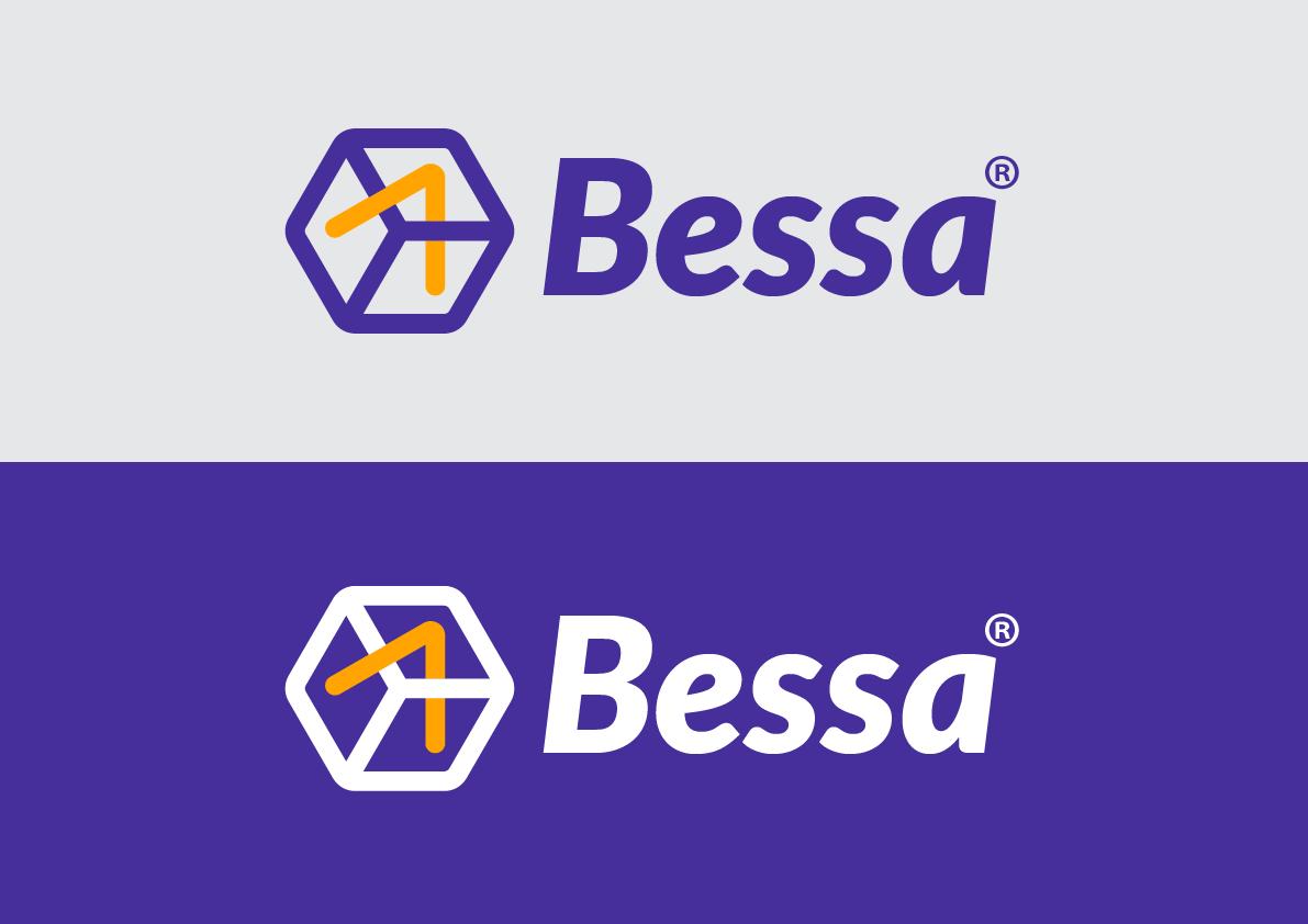
The icon was designed around a simple box, representing the packaging used throughout Bessa's product range. Whether supplying gloves, food containers or catering consumables, the majority of the company's products are delivered in cartons, making the box an instantly relevant symbol for the business.
Inside the box sits a bold arrow, representing movement, delivery and distribution. This symbol reflects Bessa's commitment to supplying businesses quickly and efficiently, reinforcing the company's role as a trusted wholesale partner rather than simply a product manufacturer.
The icon is simple enough to function independently from the wordmark, allowing it to become a recognisable brand symbol across packaging, vehicles, uniforms and digital platforms.
Colour Strategy
Reliability with High Visibility
The colour palette combines deep purple with vibrant orange to create a strong, modern identity.
Purple communicates professionalism, trust and reliability—qualities that are particularly important in the medical and wholesale supply sectors. Orange provides contrast while symbolising speed, efficiency and logistics, naturally reinforcing the delivery concept represented by the arrow.
To maximise versatility, I created two versions of the logo. The first is designed for light backgrounds, using the original purple and orange colour palette. The second is optimised for dark backgrounds, where the typography and box outline switch to white while preserving the brand colours inside the symbol. This ensures consistent recognition across printed materials, packaging, uniforms, vehicles and digital applications.
Identity System
Professional Across Every Touchpoint
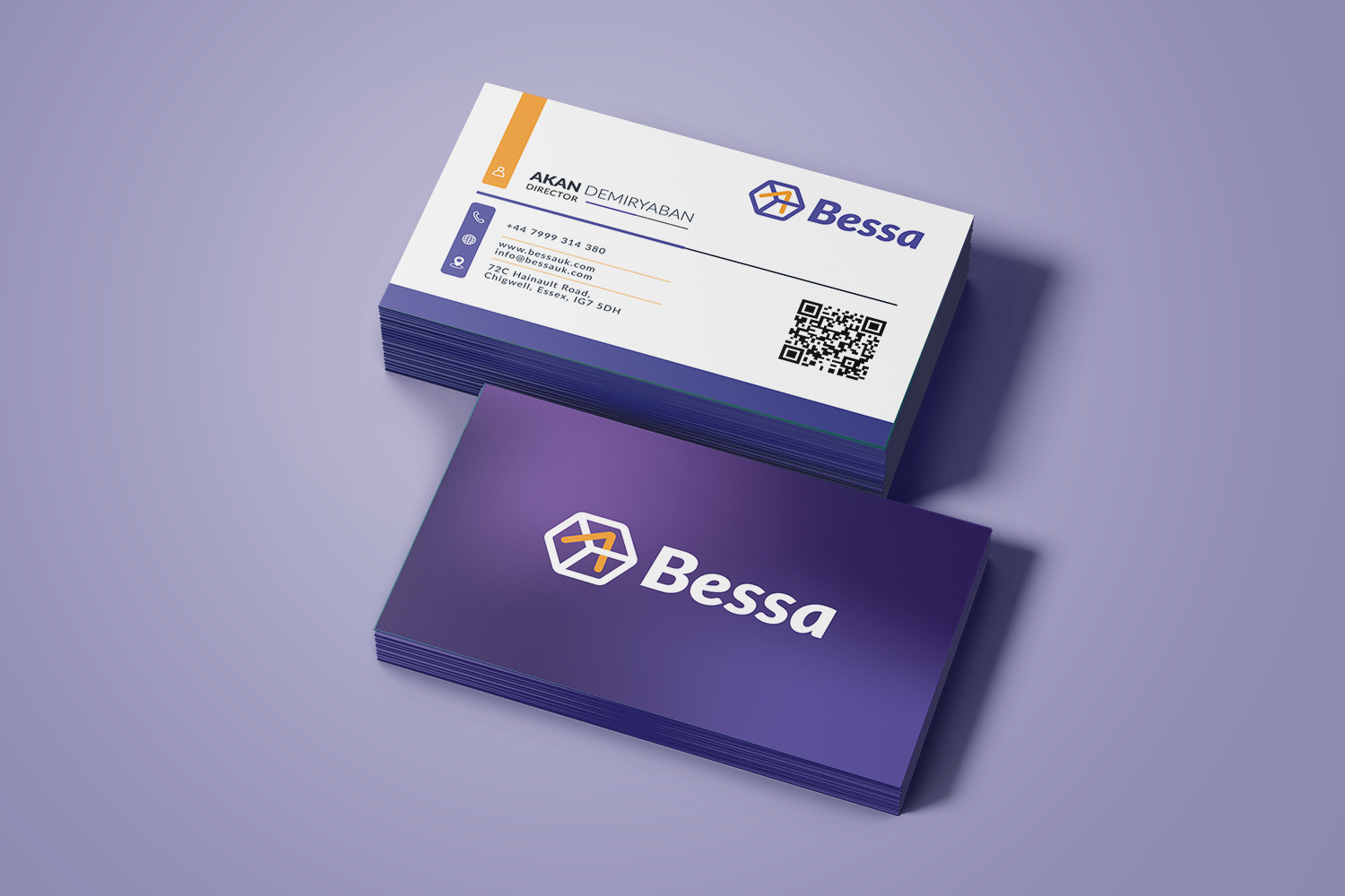
The supporting mock-ups demonstrate how the identity translates into practical business applications while keeping the logo as the primary visual element.
The business card was designed with clarity and functionality in mind, presenting contact information in a structured layout that reflects the organised nature of the business. The colour accents create clear visual hierarchy while maintaining consistency with the overall identity, ensuring the card remains professional and immediately recognisable.
Together, the logo, icon and supporting materials create a cohesive identity that reflects Bessa's role as a dependable wholesale supplier, balancing professionalism with a modern visual language that can continue to grow alongside the business.