fallen cherries
*
fallen cherries *
Logo Design
Brand Identity
The objective of this project was to create an elegant and memorable identity for Fallen Cherries, an independent London-based fashion and lifestyle publication focused on wearable trends, capsule wardrobes and honest shopping edits. Rather than following the loud, trend-driven aesthetic often seen in fashion media, the goal was to create a logo that feels timeless, refined and feminine while still remaining highly recognisable across digital platforms.
The identity was designed to reflect the publication's editorial voice—clean, stylish and approachable. Every element, from the typography to the colour palette, was carefully chosen to communicate sophistication without feeling overly luxurious or inaccessible.
Typography
Soft Elegance with Editorial Character
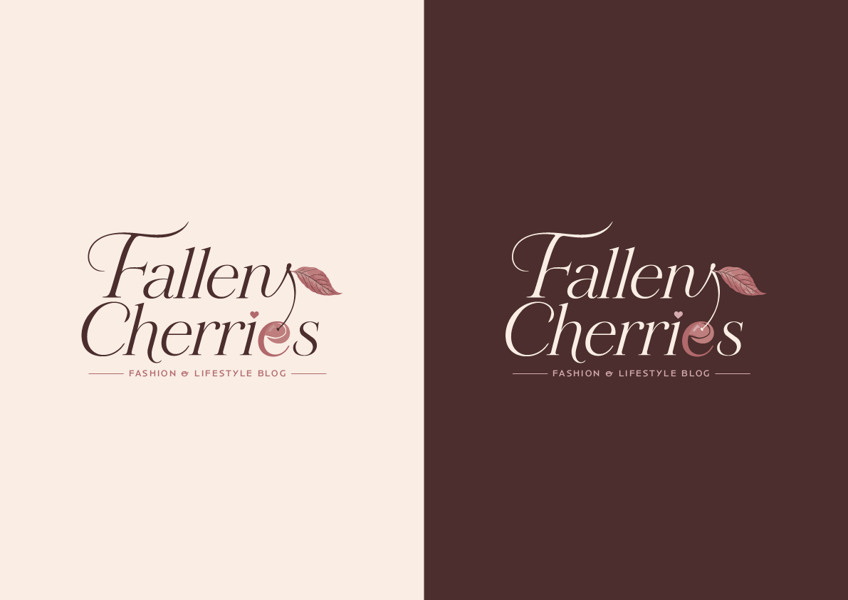
The typography plays the leading role in the identity. A high-contrast serif typeface was selected to give the logo an editorial feel commonly associated with premium fashion magazines, while its flowing curves add softness and personality.
The stacked composition creates a balanced silhouette that works particularly well across website headers, social media and editorial graphics. Its refined proportions help the brand feel established while maintaining the lightness expected from a modern fashion and lifestyle publication.
Symbol & Colour Palette
A Name You Can Recognise at a Glance
The cherry illustration is more than a decorative element—it directly represents the brand name and becomes a memorable visual identifier. Even when the typography is too small to read, the cherry instantly signals the identity of the publication, making the logo easily recognisable across digital content and social media.
A subtle falling leaf was incorporated into the design to reinforce the "fallen" concept, adding movement and a poetic visual touch without overwhelming the typography.
The colour palette is built around soft pastel tones, including warm cream, muted cherry pink and rich chocolate brown. These colours were intentionally chosen to create a calm, elegant atmosphere that complements fashion photography and editorial layouts. Pastel colours also communicate sophistication while allowing featured clothing and lifestyle imagery to remain the visual focus.
To maximise flexibility, I created two logo variations. The first is optimised for light backgrounds, using deep brown typography for warmth and readability. The second is designed for dark backgrounds, where the typography changes to a soft cream while preserving the cherry colours and overall visual balance. This ensures consistent brand recognition regardless of where the identity is applied.
Cherry Integration
Where the Brand Name Becomes the Symbol
Rather than placing an illustration beside the logo, I integrated the cherry directly into the typography. The fruit itself forms the final "e" in Cherries, allowing the icon and wordmark to become a single visual element rather than two separate components.
The cherry stem extends naturally from the lettering, flowing into the typography before ending with a delicate leaf. This creates a continuous movement throughout the logo, visually reinforcing the word "Fallen" while making the composition feel organic and elegant.
Because the cherry is embedded into the lettering, the logo remains instantly recognisable even when simplified. Over time, viewers begin to associate the cherry icon with the publication itself, helping to build long-term brand recognition.
This approach also prevents the symbol from feeling detached from the typography. Instead of decorating the logo, the cherry becomes an essential part of it, making the identity more memorable and distinctive.